For some reason, there’s this idea floating around that you have to make a cutesy ad for your upcoming mini-sessions. You know, the ones that you buy off Etsy or make using Canva that put your photos into a cute layout and list all the info…basically an infographic for you to be able to post. Here's my marketing hacks:
DITCH IT!
Yep, I just said that. Get rid of it! Those ads don’t work. In fact, they actually decrease the chance of someone inquiring about your minis. And today I’m going to tell you why!
1. People don’t like being sold to.
I know it seems silly, but people are less likely to buy something from you if they feel like they’re being sold to. If they’re scrolling through Facebook and they see your ad pop up, odds are they’ll just keep on scrolling.
Instead, try using a single image that will slow their scroll long enough to read the caption! If they don’t KNOW it’s an ad going into it, they’ll be more likely to actually read what you have to say.
2. You’re giving away too much information.
If you’re laying out the date, time, location, and the price, you’re giving away way too much info. The goal is to get someone to inquire about your minis so you can sell them on it. If you don’t leave them any reason to ask questions or reach out to you, you’re taking away your chance to sell!
By using a single image, you can give some information in the caption, and then leave them with a strong call to action telling them exactly what you want them to do (email you, comment, click your link, etc.)
3. You are blending in with the crowd.
We all know the photography industry is heavily oversaturated. By using the typical mini-sessions ad, you’re going along with what everyone else is doing. If you want to book, you’re going to have to stand out amongst the crowd!
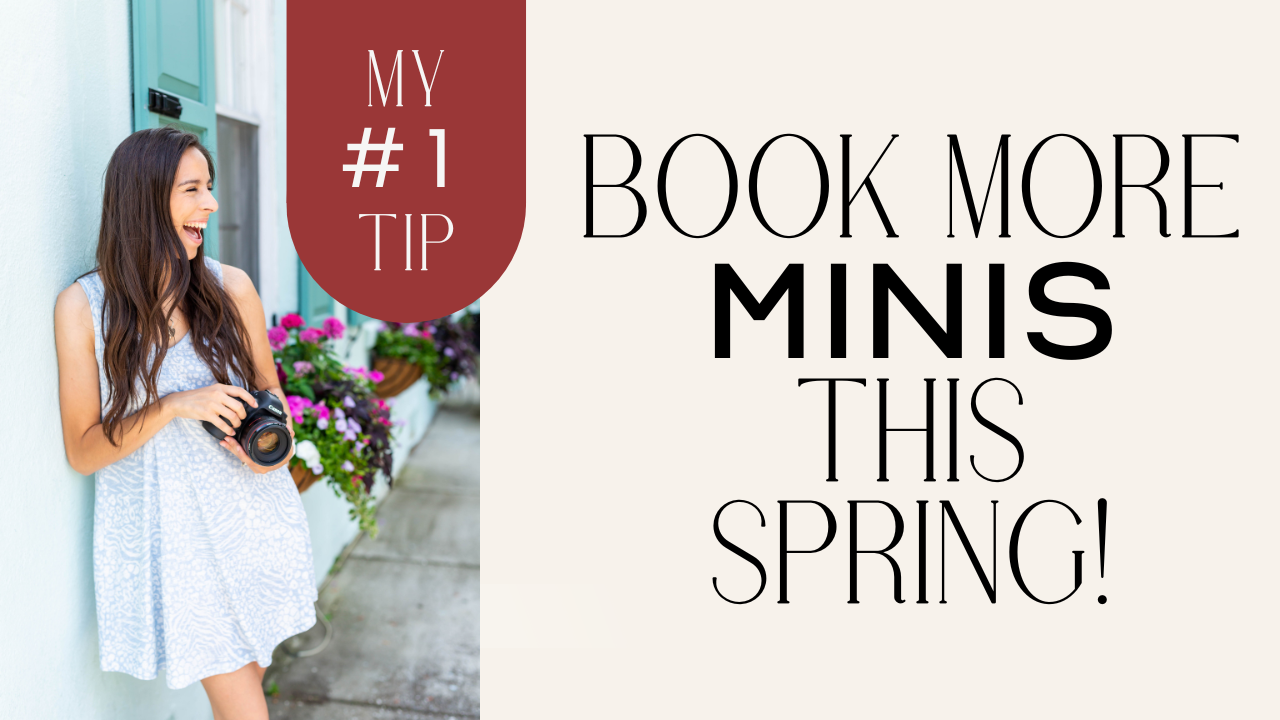
Using a single image without any text on it will help keep the focus on your beautiful photography instead of on the price. If someone slows their scroll because your stunning photo caught their eye, I’m telling you they’re WAY more likely to book with you over the next person!
I could go on and on about marketing hacks. I really do love it! If you haven’t checked out my free 1-hour class, “How to Market, Monetize, & Grow Your Photography Business with Mini-Sessions,” you’re missing out!
You may also like…
“My 3 Favorite Family Posing Prompts”
“3 Tips for Advertising Your Mini-Sessions”
“4 Reasons Why Your Mini-Sessions Aren’t Booking”
not sure where to begin?
here's a great place to start
Get practical business advice (did we mention, *free?*) every week to help you grow a thriving, profitable photography business! From behind-the-scenes editing tips, to posing and marketing - here are some of our most popular posts!
behind the lens
our *behind-the-scenes* membership program
Behind the Lens is our BRAND NEW MEMBERSHIP program geared towards family photographers! Each month our members receive a behind-the-scenes video of me shooting a REAL family session. As a bonus, I also include an EXCLUSIVE MASTERCLASS each month teaching on business topics I don't teach anywhere else! As our MOST AFFORDABLE, value-packed educational resource in our shop, it's a no-brainer for anyone looking to level up their family photography game! Join me every month behind the lens.
